Wednesday, 22 February 2017

Friday, 17 February 2017

Thursday, 16 February 2017
Final constructions: Website
http://shantelleb99.wixsite.com/hawaymag
This is the link to my website which was made on Wix.com. The pages you can access are, the homepage, DIY & Lifestyle and Culture & Events.


Monday, 23 January 2017
Time management
All of my recent posts have been 'time management' as there isn't much changing. I am still progressing with my constructions so there isn't much I can really talk about. In this post I am going to include what my magazine constructions look life so far. I know that I have improvements which I will work on now.


In addition, I created my billboard:

Monday, 9 January 2017
Time management
It has been a while since I posted because my work hasn't really changed since my last post. So far, I have completed my front cover, contents page and double page spread. I have started my billboard and progress is being made on my website.
I am still experimenting with images and text on my billboard so I have moved onto my website creation. I am doing this by using the WIX website and using a blank template to make the work my own.
Overall, I feel that I am progressing well with my work and is on target with where I need to be. Once my website and billboard are finished, I will have a start on my evaluation questions.
My website so far...
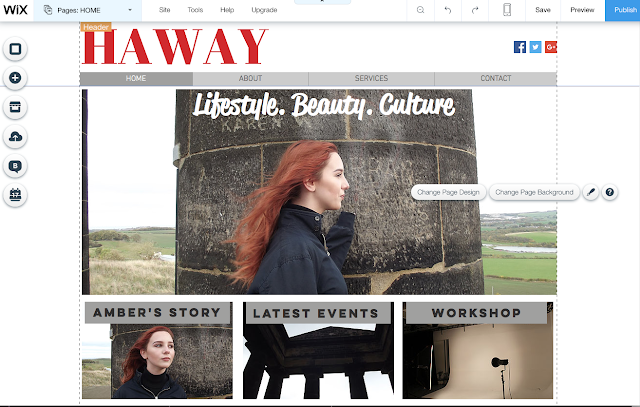
I am still experimenting with images and text on my billboard so I have moved onto my website creation. I am doing this by using the WIX website and using a blank template to make the work my own.
Overall, I feel that I am progressing well with my work and is on target with where I need to be. Once my website and billboard are finished, I will have a start on my evaluation questions.
My website so far...

Friday, 9 December 2016
Time managment
So far, I have just about finished my contents page, front cover and billboard but I may still have some slight changes to make. At the moment, I am working on my double page spread and once I have done that, my magazine will be finished. After that, I will then start on m website but that is likely to be after christmas. Before we break up for christmas, I plan on having all of my magazine constructions completed.
Thursday, 24 November 2016
Time management
Now that I have near enough finished my front cover, I can move onto making my contents page. At the minute, I am just experimenting with different images, font etc until I decide which ones I will actually use. Again, this construction will take a few weeks so that I can get it right because for my AS content page, it was rushed and didn't look very good.
Friday, 18 November 2016
Progress: Front cover
As I construct my front cover, I am going to record the changes I make to show how my ideas will develop and change. It also makes it clear where my strengths and weaknesses are which will help me when it comes to the evaluations.


Already, I can see how my ideas have developed since creating my AS work. I now have a better understanding of Photoshop and other websites I can use to create my magazine.


Time management
In todays lesson I am going to start creating my front cover on photoshop. This will probably take me a few lessons so I aim to get it done quickly but be able to concentrate on it. I have all of the materials I need in order to start constructing my work and I have pretty much completed my research an planning.
From this post, I will be spending the next few weeks creating my front cover which means I won't be posting on my blog as much. Once that is completed, I will then make a time management post on what I will be creating next.
From this post, I will be spending the next few weeks creating my front cover which means I won't be posting on my blog as much. Once that is completed, I will then make a time management post on what I will be creating next.
Monday, 7 November 2016
Photographs
In total, I have taken 61 photographs. As you would imagine, I can't use all of these, so I am going to categorize met of them into useful and non useful but I won't be including the all. The images I will say are useful will most likely be used in my magazine, billboard or double page spread.
I have an idea on what photographs will be used in my different constructions but that will be made more clear closer to the time. By using slideshow to present my suitable and non-suitable photographs, I can clearly see them quickly and efficiently.
I have an idea on what photographs will be used in my different constructions but that will be made more clear closer to the time. By using slideshow to present my suitable and non-suitable photographs, I can clearly see them quickly and efficiently.
Time managment
Today I am going to do a rationale on my flat plans and then upload them to my blog. To do this I am looking at other students A2 work to see how they have evaluated their flat plans and use that to expand my own. After this, I am going to upload my photographs and say which ones are or aren't suitable for my constructions.
Friday, 4 November 2016
Flat plans
Flat plans
When creating these flat plans, i had to take into consideration:
- Composition/framing
- Color scheme
- Images
- Text
- Layout
- Font
- Conventions
- Language
if you didn't think and research all of these, your work wouldn't look professional. An example is that these will determine if your work is a poster or if it is a front cover.
Front cover

My color scheme (red, white and grey) will be the same throughout so that each of my constructions match and link together with that regional theme. The layout of my front cover is a standard design but I will make it look unique and my own. My front cover will be dominated by the main image which will cover the full frame. I chose to do this because I have seen it in most culture magazines and it fills in all of the blank spaces. The main image is going to be of a landscape, so to make it look more interesting I will have to use a font which will stand out against the bold image. I haven't made a decision on a definite font, but I know the sort of style I am going for which is a modern/classic look. I have included all of the essential conventions such as a masthead, barcode,issue date, main image and cover lines etc which I had learnt from my AS work. Now that I am moe familiar with these conventions, I have became more creative in how I will use them.
Contents page

Most of the contents pages I have looked at are all two sided. However, I wanted my double age spread to be two pages so I chose to just use the one for my contents. In terms of space I will have to persevere and make good use of what I have got. To do this, I am going to make my images into different shapes using photoshop just so they aren't a plain square shape. This will make it look more interesting and unique. I am still including all essential conventions such as a masthead, page number, date, images and text and change my layout around a bit. From my AS work, I think my weakest point was my contents page so this year I have looked into a researched more so that I can achieve my full potential. So as I have progressed I have used different resources and ideas to make my work improve. The font for my contents page needs to be easy to read as it will all be in one place, so I will make it clear and understandable.
Double page spread


For my double page spread, I am choosing to have a very simple layout. The first page will be a masthead, introduction and article that will be in a Q&A form. I chose to do this because it is different to my AS work, and it will link in with my culture genre. again, the colours will stick with red, white and grey, however I may use more pop of color to make it presentable. I want the question font to be different from the answer font so that you can read them clearly and separate them from each other. Here, the language should be understood by my target audience as it is the main focus to interest them. I am choosing to focus my double page spread on an article names "North east blogger of 2016" as it will cover a range of cultural factors and appeal to my female target audience.
Billboard

The majority of billboards are revolved around the image as it is used for advertising or promoting something. So the layout I have chosen goes along with that stereotype of a tradition billboard. I will have a main image and then include a slogan like text, and the company logo. My font will be bold and clear so that people who see it will understand what it says, but will still be able to concentrate on the image. I am situating the masthead in the top right-hand corner so that you can see the image, and I am having the slogan like text in the bottom left-hand corner so they are both out of the way but still visible to see and read.
Website

This is going to be the home page of my website. my biggest inspiration for this layout came from The Crack magazine website and the Vibe website. As they are both regional magazine companies that include some culture, I felt like it was suitable to have them as a starting point. I have included all of the essential conventions such as the masthead/logo, navigation bar, search bar, images and text. I really like the layout and presentation of this homepage because you get to see bit of everything and it looks like it will be easy to use. My images will be quite varied but all link to similar things gong on or happening in Sunderland. The text will be very brief and short at the bottom of every image to introduce each article on a hyperlinked page. And the font I am going to use for this will be a small black style but will be clear to see and rad next to the images.

This is my first hyperlinked page to my website. This page will be focused on an article that will link to my magazine and the photographs I have taken. It may be a more developed subject that was included in my contents page, such as the details of an event that is going to happen in Sunderland. The layout of this page is going to be very simple and plain because I don't want it to look detailed or overpowering. The font is also going to match the sale of the homepage and the second hyperlinked page, this makes it correlate and look tidy. Each image will represent an event in Sunderland and then have a date and time underneath so that when you click on it, it will give you full details on the event. So this page will be very brief and simple.
Time management
In todays lesson, I am going to finish creating my flat plans on powerpoint and then upload them onto my blog. This means that I have a clear stating point when making my constructions. Again, I am making steady progress and working at a pace that I can get enough work done in the week to be caught up. Once I have done the flat plans, then I can do a rationale on them to develop my work and ideas.
Monday, 31 October 2016
Model organization
In order to be prepared for the day, I communicated with my models a few days before to ensure they knew the outfit I wanted and how to be dressed etc. So what I did was text my model and tell her what to wear, where to be and at what time. this meant that i could arrange a date where the weather an day would be suitable for my photos.
My models where my friend Amber, aged 17, her brother aged 10 and my sister aged 10. I chose these as my models because I can co-operate the fashion/beauty content with the family/events content. I found it really useful to have an age range because that has what inspired me in magazines such as 'VIBE', it always used photographs of adults with children just to give that regional culture feel.

My models where my friend Amber, aged 17, her brother aged 10 and my sister aged 10. I chose these as my models because I can co-operate the fashion/beauty content with the family/events content. I found it really useful to have an age range because that has what inspired me in magazines such as 'VIBE', it always used photographs of adults with children just to give that regional culture feel.

Photoshoot planning
Although I have already taken my photographs, I have still been working on my research and planning. However, I did do some planning on weather, locations etc before hand so that I could get the best out of my day and high quality images.
The location
I know that all of my locations are open to the public all day, everyday so I could just pick which day I wanted. I also knew that Herrington Country Park had a cafe and park which would cater us for the day. (Two of my models were 10 year old so it would occupy them, hence why I chose these locations).

The weather on the day was just right. I didn't want it to be too bright or too dull, so it was just in-between. the day my images were taken was on the 27th October. I took my images around 13:00 hours as it was the most suitable weather and I could get there for that time.
 As you can see, it was quite a cloudy day but still some sunshine. I feel like this gave me good lighting for the images I took, and it will also represent the typical weather in Sunderland.
I did also plan the times I would set off which was around 12:30pm so that I could get their at a suitable time where it won't be as busy or hectic. To do this I planned by bus timetable and models to meet at a certain place so that we would all arrive together and be organized. I made sure my models available at this specific date as everything would be organized and the weather would be suitable.

The location
I know that all of my locations are open to the public all day, everyday so I could just pick which day I wanted. I also knew that Herrington Country Park had a cafe and park which would cater us for the day. (Two of my models were 10 year old so it would occupy them, hence why I chose these locations).

The weather on the day was just right. I didn't want it to be too bright or too dull, so it was just in-between. the day my images were taken was on the 27th October. I took my images around 13:00 hours as it was the most suitable weather and I could get there for that time.

I did also plan the times I would set off which was around 12:30pm so that I could get their at a suitable time where it won't be as busy or hectic. To do this I planned by bus timetable and models to meet at a certain place so that we would all arrive together and be organized. I made sure my models available at this specific date as everything would be organized and the weather would be suitable.

Audience Profiles

Unfortunately, I had difficulties attaching the actual presentation so I took a screenshot. I have found Prezi very useful for my A2 Coursework as it allows me to present my work creatively. This has progressed since the start of my AS coursework as I am now more familiar with how to use websites such as Prezi.
By creating these audience profiles, it allows me to express the sort of audience I will be appealing to. It reminds me of the interests of my target audience, therefore it will keep me on track with what I need to include to make my magazine interesting and enjoyable to each reader. In addition, by using the software 'Prezi', I am becoming more confident on how to navigate it and create a good piece of work which enriches my blog. I have chosen four random people from my friends to show the sort of interests that my age group have in mind. They all have a different area of interest which is ideal for my culture magazine as I want to include a variety of content that links to my region.
Subscribe to:
Posts (Atom)